Can One Scene Reveal Whether Your Visual Novel Is Easy to Read?
August 30, 2026
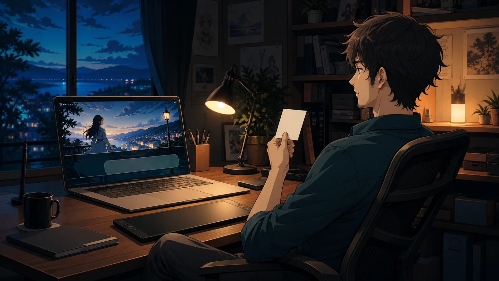
A visual-novel creator can read the same scene fifty times and still miss the moment when reading becomes work. You already know who is speaking. You remember the line before the name appears. You know that the pale option is clickable and that the blue sentence is an inner thought. A new player knows none of that.
You do not need to audit an entire story before finding the first problems. Choose one scene that contains a background change, two speakers, narration, and at least one choice. Play it at a normal pace without editing. That scene will not prove that the whole visual novel is accessible, but it can reveal whether the interface and writing repeatedly ask the player to guess.
The goal is not to collect abstract rules. It is to leave with a short repair order: what prevents reading, what causes hesitation, and what can wait.
Begin with one uninterrupted read
Pick a scene that is visually difficult, not the cleanest room in the story. A bright festival, a snowy window, or a face placed close to the dialogue box will test the interface better than a dark empty wall. Include one long line and one choice so the scene exposes both reading and interaction.
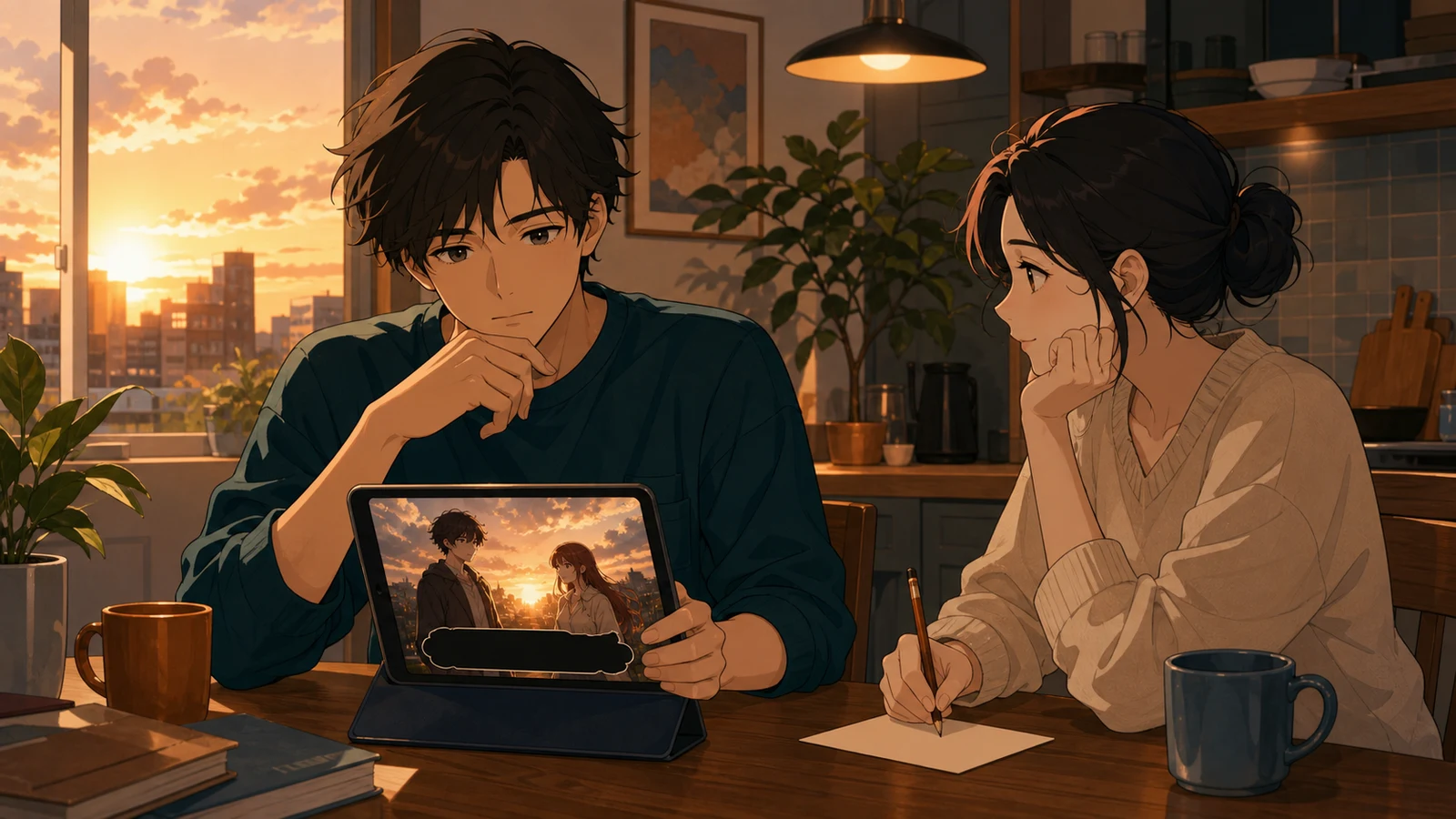
Ask someone unfamiliar with the draft to play the scene once. Do not explain the speaker colors, the thought style, or which part of the screen advances the dialogue. Watch where they lean closer, stop before choosing, reread a name, or click twice. Those pauses are evidence. A player may not describe the cause accurately, but the location of the hesitation tells you where to inspect.
If nobody else is available, create distance from your own draft. Open the preview at a size you normally use, sit back, and read aloud without touching the editor. Then reduce the window or use another screen. Familiarity will still hide some issues, but changing the viewing condition makes crowded lines and weak boundaries easier to notice.
Record only the first visible failure in each moment. If a line is both too long and low contrast, write down that it disappears against the background before debating the prose. Fixing the strongest obstacle first keeps the audit from turning into a general rewrite.
Can the words survive the art behind them?
Game text is not read on a blank page. Every background changes the light behind the dialogue box, and every portrait adds edges and color near the speaker name. A style that looks clear in one scene can collapse in the next.
Microsoft's Xbox Accessibility Guidelines treat text size, spacing, and contrast as parts of the same reading problem. WCAG uses measurable contrast thresholds for ordinary text, but a visual novel also needs practical scene testing because transparency, glow, shadow, and moving art change what reaches the eye. A color value alone does not describe the final frame.
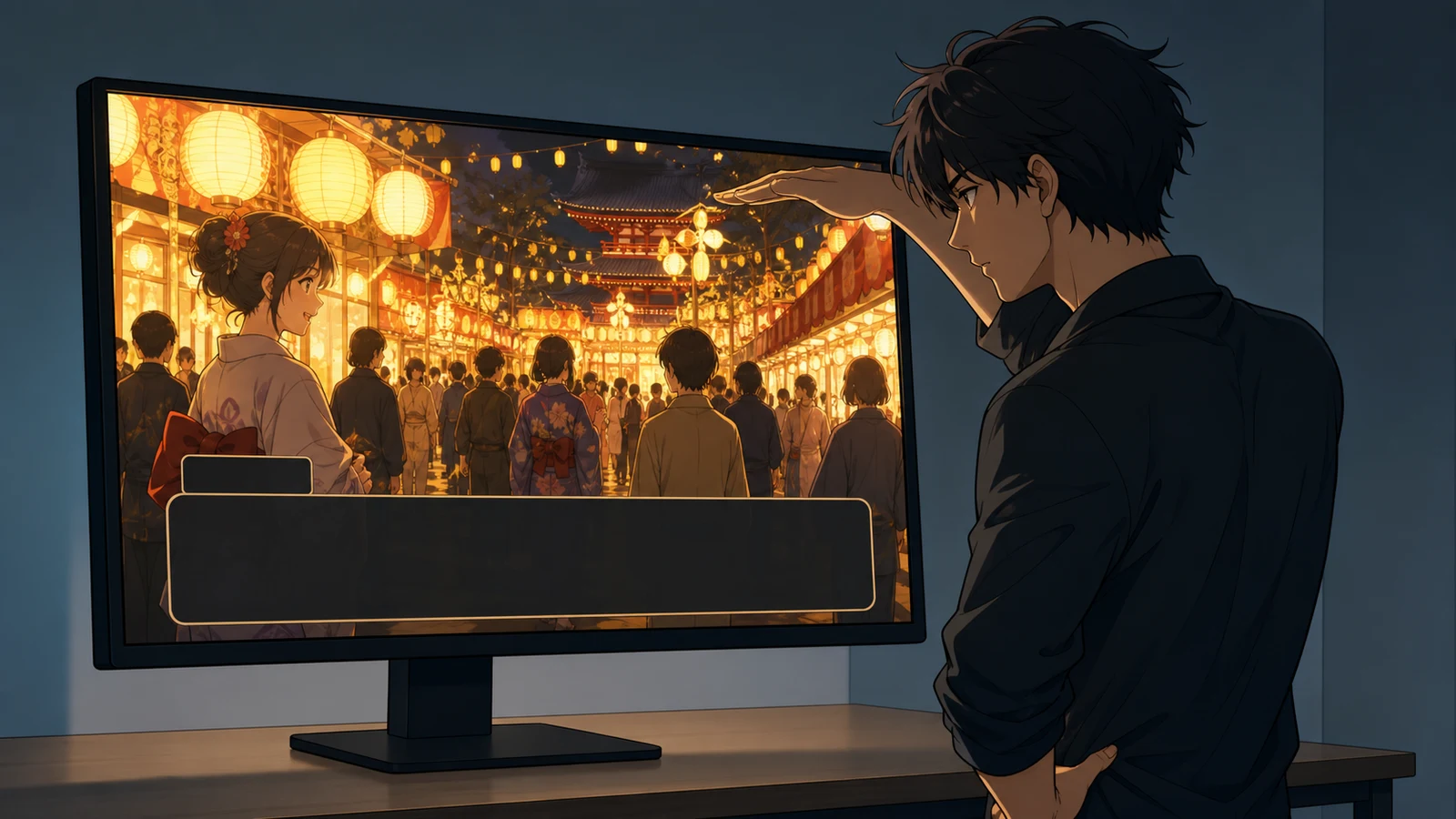
Freeze the hardest frame and look at three boundaries. First, can you separate the letter shapes from the dialogue box? Second, can you separate the dialogue box from the background? Third, can you find the speaker name without scanning the whole screen? If any boundary depends on the background happening to be dark, it is fragile.
Do not solve every problem by making the box completely opaque. That may work, but it can also cover expression and staging that the scene needs. Strengthen the weakest boundary first. A darker box, a slightly brighter text color, more padding, a calmer area behind the name, or shorter lines may be enough. Test the change against both the brightest and darkest scenes before keeping it.
Avoid using color as the only signal. If inner thoughts are merely blue and spoken lines are white, a player who cannot distinguish the colors receives no distinction. Parentheses, a stable label, a different border treatment, or another non-color cue can carry the same information. The Xbox guidance similarly recommends pairing color with shape, text, or another cue when color communicates meaning.
Does the player know who is speaking?
Visual novels often make the active portrait brighter and the others dimmer. That is useful, but it should support the speaker name rather than replace it. Portraits can be cropped on smaller screens, characters can stand off frame, and narration may arrive with no portrait at all.
Read the scene while covering the character art with your hand. Can you still tell whether the line belongs to a character, the protagonist's thought, or the narrator? If the answer depends on memory, the channels are too similar.
The first repair is usually assignment, not decoration. Check that every spoken line has the intended speaker and every narration line is actually narration. Then make the names and thought treatment consistent. Microsoft's guidance for text-only dialogue specifically calls for identifying the speaker rather than assuming sound or image will do the job.
Consistency matters more than novelty here. A thought style that changes between brackets, italics, and color across three scenes makes the player relearn the interface. Choose one pattern and reserve it for one meaning.
Is the line too dense for the moment?
Readable type cannot rescue a paragraph that asks the player to hold too much information before the next click. Dialogue-box density is a writing issue and a layout issue at once.
Look for a line that fills most of the available box. Read it aloud. If it contains two actions, a memory, and a conclusion, find the natural turn and split it. The player gets a breath, the portrait or background can react between beats, and the text no longer competes with the box boundary.
Do not cut every sentence to the same length. A confession can need a long uninterrupted line. A sudden realization may need three words. The audit is not trying to make a metronome. It is checking whether the visual space and dramatic beat agree.
Choice labels need the same pass. A player should be able to read all options before feeling pushed to click. If one option wraps across several lines while another is a single word, check whether the long label contains explanation that belongs in the setup. Keep the immediate action in the button and put necessary context before the menu.
What can Novelez help you check?
Novelez does not certify accessibility, simulate every visual condition, or replace testing with players who have different needs. The current player also does not give a creator a complete accessibility report.
What it does provide is a direct loop between scene text and a playable browser preview. Dialogue blocks preserve the assigned speaker, the player displays a name with spoken text, and inner thought has a second cue in addition to color. That makes it possible to choose a difficult scene, edit the line or assignment, and replay the same moment without rebuilding the project elsewhere.
Use that loop narrowly. Change one thing, then replay the full scene rather than staring only at the edited block. A darker box may solve contrast but cover a face. A shorter sentence may read better but make the next reaction arrive too abruptly. The scene, not the property field, is the unit that must work.
Retest at the distance where people will read
After the first repairs, run the scene again from its beginning. Use the bright background, the longest line, the thought, and the choice in the same order. Confirm that the fix survives the transition instead of looking good only in a paused screenshot.
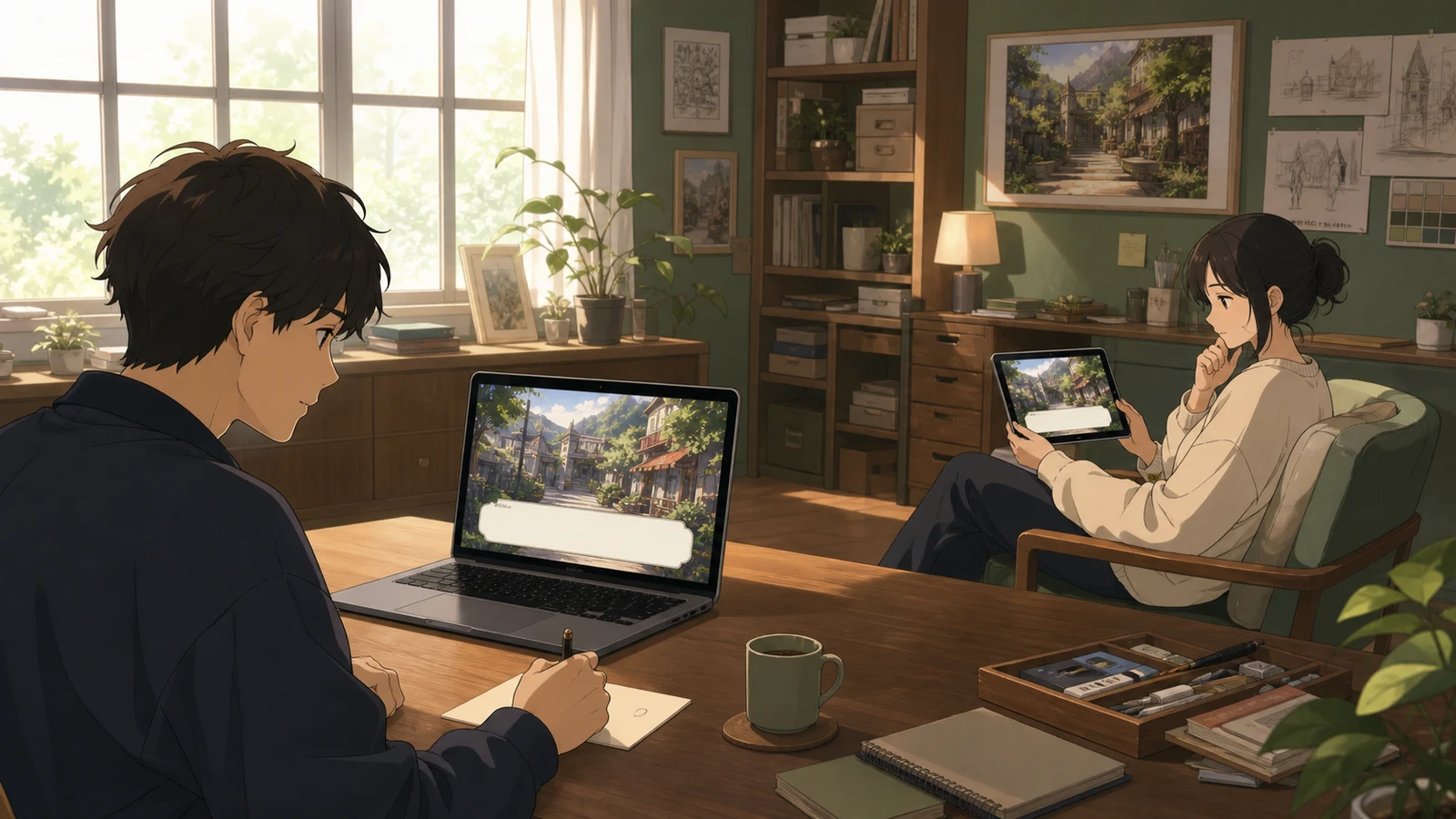
Then change one viewing condition. Try a smaller browser window, a dimmer room, or a screen placed farther away. You are not reproducing every disability or device. You are checking whether the design has any margin before it fails.
Keep the remaining notes in three groups. Blocking means the player cannot read or identify the interaction. Confusing means the player can continue but must guess the speaker or meaning. Polishing means the scene works and the change would improve rhythm or style. Finish blocking items first, then confusing ones.
One clean scene does not finish the accessibility work. It gives you a repeatable audit you can carry into other backgrounds, languages, and routes. Which scene in your current visual novel is most likely to fail this test: the brightest background, the longest exchange, or the choice with the most text?