Is Your Visual Novel Easy to Read? A Practical Accessibility Checklist
July 21, 2026
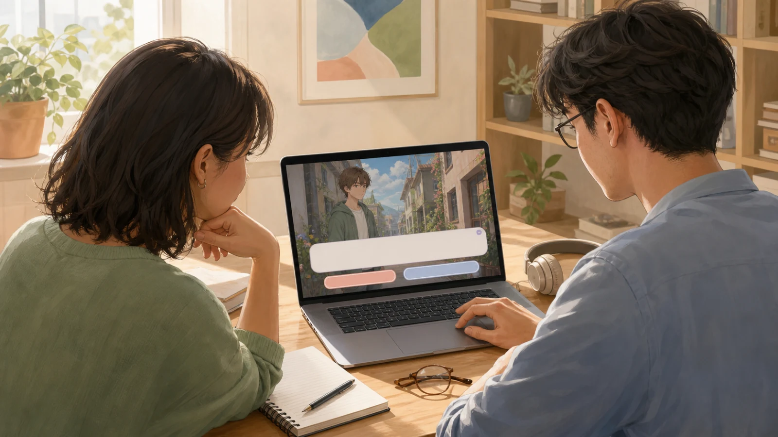
Have you ever finished a beautiful visual-novel scene, handed it to someone else, and watched them lean toward the screen before they even read the first line?
That tiny movement tells you something. A visual novel can have wonderful writing and art, yet still make the player work too hard to reach them. Small dialogue, weak contrast, crowded choices, missing history controls, or important information carried by color alone can quietly push readers away.
Accessibility is bigger than a single checklist, and proper support for screen readers, keyboard navigation, captions, or photosensitivity deserves real technical work. But every creator can start with a practical first layer: make the core reading and choosing experience comfortable, clear, and testable.
Here is a checklist you can use before your next public build.

👀 Can the dialogue be read without effort?
Your dialogue box is the part of the interface players look at most. Treat it as a reading surface, not decoration.
Start with five questions:
1️⃣ Is the type large enough at the actual play size? Do not judge it only on your large design monitor. Open the game on a laptop and a smaller screen.
2️⃣ Is there strong contrast behind every line? Beautiful background art changes from scene to scene. A dialogue box that works over a night scene may disappear over a bright sky. Use a stable panel, shadow, or opacity treatment so readability does not depend on the artwork.
3️⃣ Is the font doing too much acting? Decorative fonts can carry mood in a title. Long dialogue needs calm letterforms, predictable spacing, and clear punctuation.
4️⃣ Are lines comfortably short? If the eye must travel across nearly the whole screen, reading becomes tiring. Give the text width, line height, and margins room to breathe.
5️⃣ Can the player control the pace? Text speed, advance timing, auto mode, and a history or backlog are not luxury details for a text-heavy game. They help fast readers, slow readers, language learners, and anyone who missed a line.
Try the “tired reader” test: lower the screen brightness, sit slightly farther away, and read several minutes of dialogue at the end of the day. If you start squinting or losing your place, the UI needs another pass.
🎨 Does meaning survive without color?
Color is useful, but it should rarely carry essential meaning alone.
If a selected choice is only green and an unavailable choice is only red, some players will not receive the difference. Add another signal: shape, icon, border, label, position, or opacity. The same rule applies to affection meters, route status, warnings, and speaker identification.
Take screenshots and view them in grayscale. Can you still tell what is active, disabled, dangerous, or selected? Then check contrast in the busiest and brightest scenes, not only the clean mockup used in your design file.
Be careful with flashing transitions, rapid screen shakes, and high-frequency effects. If they are not essential, reduce them. If they are essential, give players a way to lower or disable them and make warnings clear before exposure.
🖱️ Are choices comfortable to select?
A choice is both a narrative decision and a button. It needs emotional clarity and physical usability.

Check that:
- the entire visible choice area is clickable, not just the letters;
- choices have enough space between them to prevent accidental selection;
- hover, focus, and selected states are visibly different;
- long translated text can wrap without covering another option;
- the player can understand which control currently has keyboard focus;
- important choices do not appear while the player is still trying to read the previous line.
Also examine the wording. Two options that begin with the same four words are harder to scan. Put the meaningful difference early. “Ask about the letter” and “Hide the letter” are easier to compare than two full sentences whose difference appears at the end.
⌨️ Can the core experience work beyond a mouse?
Keyboard access helps far more people than a narrow definition of disability suggests. Some players use a keyboard by preference, some cannot use precise pointer movement comfortably, and some play on devices where hover does not exist.
At minimum, test whether a player can advance dialogue, move between choices, confirm, go back safely, open settings, and reach save/load or history without getting trapped. Focus indicators should be visible. The order should follow what a reader naturally sees on screen.
True screen-reader support requires semantic controls and testing with the actual assistive technology; it cannot be proven by visual inspection. If you promise it, test it. If it is not supported yet, say so honestly and make the rest of the interface as robust as you can.
🔊 Are sound and motion optional information channels?
Never rely on sound alone to communicate a critical event. If a door unlocks, a timer ends, or danger arrives through audio, pair it with a visual or textual cue. Dialogue that exists only as voice should have captions.
Separate volume controls for music, effects, and voice are helpful because players need different mixes. An abrupt loud sound can be a comfort and safety problem even when the overall game volume seems reasonable.
Motion deserves the same thinking. Give players time to read, avoid forcing auto-advance during important dialogue, and consider reduced-motion options for shaking, parallax, and animated transitions.
🧪 How should you playtest accessibility?
Do not ask only, “Did you like it?” Give testers small jobs.

- Find the settings without help.
- Change text speed and volume.
- Make a choice using only the keyboard.
- Recover a line you advanced by accident.
- Save before a branch and return to it.
- Play a bright scene and a dark scene.
- Try the longest translated choice in your project.
Watch where people pause, lean forward, misclick, or ask what is selected. Those moments are interface evidence.
Test with people outside the team when you can. Your team already knows what every icon means and where every button lives. A fresh player shows you the interface that actually exists.
🌿 Where Novelez fits
Novelez lets creators organize scenes and choices visually, place assets, preview the playable result in the browser, and share a project through its web/gallery flow without starting from code. That makes it useful for repeated readability and choice-flow checks while a story is still editable.
It does not mean every accessibility feature is automatically solved. Use the player preview as a test surface: inspect dialogue over different backgrounds, test long choices, check scene pacing, and invite other people to play before publishing. If you need deeper platform-level support, document it as a production requirement rather than assuming a visual editor provides it.
✅ The 60-second pre-publish check
Before you share the next build, ask:
- Can I read every line over the brightest background?
- Can I identify states without color alone?
- Can I select every choice without precision?
- Can I recover missed dialogue?
- Can I control text pace, audio, and disruptive motion?
- Can I complete the core flow with a keyboard?
- Have I tested the real build with someone who did not design it?
Accessibility is not a polish pass you apply after the story is finished. It is part of how the story reaches a person. Start with the reading experience, test honestly, and improve one barrier at a time. 🎬
July 21, 2026